BRITDOC’s Luke Moody questions the power of words on screen in recent documentary journalism.

Long and short form documentary film, informed by deep journalism, is encountering a formal challenge. As filmmakers and editors strive to make poetry of complex information, they increasingly find creative anchoring in journalism’s most comfortable medium: the written word.
Looking more broadly, Eric Hynes gave focus to the recent foregrounding of writing in documentary film as a means of scripting structure and voiceover. His article closed with a praising recognition of the powerful editorial layer involving writing words: ‘deploying composed language in documentaries, sometimes it’s the most effective and expressive tool at hand’.
Composed language, and more specifically text appearing on screen, is also one of the most dangerous tools of expression. Text gives meaning, most often by buttressing more abstract imagery to provide a rigour of apparent facts and shackle observed evidence with clear, informed narrative stricture. However dominant their narrative function can be, the practice of writing text on screen is often the least prioritised part of a film’s conception, production or edit.
A resurgent modern reliance upon on-screen text suffers from two key editorial impediments: their attempt to be objective, without attribution to the director or informant, and their lack of creative rigour in both form and content of the type. Words are dropped into documentary films, tweaked and moved around in the final stages of a cut with little conceptual, poetic or critical approach towards the aesthetic harmony and struggle of language, typography, sound, time, and moving images.
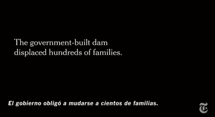
In the burgeoning field of short form documentary journalism The New York Times Op-Docs, The Guardian Documentary and Field of Vision have all relied heavily on text cards, each with a distinct choice of style or absence of. Due to their short length, these works commonly necessitate concertina folds in linear narratives to abbreviate complex context and chronologies. The go to solution has been textual explainers. Their screen appearance commonly conveys numeric facts and story updates not easily communicated through creative methods. They are the denotative voice of connotative documents. In new film journalism the written word could be regarded as something belonging to another medium, and ideally avoided as an adversary of formal ambition and reminder of a type of written journalism they are trying to escape.

Text cards simultaneously make us aware of informational gaps and offer suture in narrative, they permit chronological leaps, display updates, legal disclosure, statistical figures, locational and temporal context. Their essential function is to fill in the blanks, but are these blanks that could not be otherwise audio-visually represented or is this deployment and reliance a result of lazy or desperate editorial glue? Why have written words in documentary become the sober scaffold to creative constructions? Why have they become confirmations and not questions? Fact not poetry?
New short form documentary journalism is an attempt to advance topical storytelling beyond traditional broadcast formats. One epidemic habit of broadcast news content is to offer screen-text on ritalin. Its antidote is No Comment TV: a programme of minimalist news show actively dismissing the use of any verbal or written contextual commentary. Their episodes consist of sequences of seemingly non-professional shots recorded at the location of a news story that ‘let the pictures do the talking’. No voiceover. Only a simple momentary flash of words establish location and date giving minimal context to the news images. These examples of short form broadcast journalism present the polar ends of a spectrum that new documentary journalism could find balance. At one end sits image based journalism that is assaulted by an overlay of abundant written and graphic context, at the other an outright rejection of language mediation through written or spoken word data.
A devaluation of over abundant non-artful screen-text is highlighted by a quote from critic David Sexton deployed in the UK trailer of Gianfranco Rosi’s feature documentary Fire at Sea (2016). The quote is used to boast the qualities of pure image based cinema with no informational interruption:
“This delicate film about the present migrant crisis provides no commentary, no text or context, it just shows – with powerful effect”.
Fire at Sea actually opens with a rapid prologue of three sequential text cards providing just enough information to inform the subsequent, highly nuanced, film. The cards reveal the name of the island, the size of the island, the distance of the island from the coast of Africa and Sicily, the number of migrants attempting to cross the sea in the last 20 years and the number of migrants who died crossing. None of these opening cards offer an author or origin of their factual content. Perhaps as a result of a rigorous distributor, or a trailer editor with some journalistic grounding, a related text card in the UK trailer differs. In upper-case the trailer’s primary text card gives a definite figure instead of an estimate and an ‘according to’. Could Rosi’s exclusion of a factual source in the film be a deliberate attempt to align his work with cinema, and not journalism? Is the intention of his textual prologue simply to place the audience in the story’s sense of scale and historical trajectory as opposed to more functional fact-giving reportage?


Field of Vision, a platform and commissioner of new visual journalism, has consistently made use of text cards in its short films and episodic series. One recent work produced by the film unit, AJ Schnack’s Speaking is Difficult (2016), is a short-form example of using text as a chaptering device and therefore as primary source of narrative structure. Twenty-five lower-third texts accumulate and punctuate the 14-minute film. They describe in reverse chronology mass shooting incidents in the USA through simple data: location, state, date, number of killed, number of injured. Each text interrupts and frames five static observational shots recorded in proximity of the shootings. The film form shows clear synergy between text, image and semantics.

Interjecting text is also a ubiquitous device in long-form documentary cinema, serving a dual structural and informational purpose. The intertitle text card, or lower-third offer a means of pause, break, and link between sections of the film that require conceptual delineation. A cluster of contemporary documentaries are dependent on the literary device of ‘chapter’ to enforce a sense of suture in otherwise fragmented movements in space, time and story: Prison in 12 Landscapes (Brett Story), Bigger Than The Shining (Marc Cousins), The Rules of The Game (Claudine Bories, Patrice Chagnard), Camera Person (Kirsten Johnson), Fragment 53 (Federico Lodoli, Carlo Gabriele Tribbioli), Concerning Violence (Göran Olsson) to name a few. This approach has much precedent in the structuralist rigour of essay film, but has only recently been seen amongst non-fiction categories of prominent film festivals.
A minimal aesthetic punctuated by sans serif, upper-case text has been a regular trait of Field of Vision’s output, but the voice and literary style of written words in each film has been to an extent variable, and in some cases fluctuates within a single film. The launching piece Notes from the Border (2015) by Iva Radivojevic opens with texts that appear to be dated personal diary entries outlining the filmmaker’s journey towards her subject in the summer of 2015. The text cards then shift towards more anonymous factual, contextual, abbreviated headlines about the refugee crisis in Greece, none with a source reference. Is this shift a result of an informational obligation? Why does the narrator’s textual person change but not the point of view of the images these words frame?

An aesthetically uniform appearance of words in Field of Vision’s output was ruptured by the episode Homeland is Not a Series (2015). The central subject of this film is the graffiti bombing of a ‘Homeland’ production set by Arabian street artists. As a film specifically focused on the art of scribing, the filmmaker is required to address the related art of writing on-screen in the film. This aesthetic challenge perhaps prompted the most radical departure of text style and font of any of the Field of Vision’s work. The language used is less descriptive, more reminiscent of playful Godardian slogans, appearing in negative response with background dialogue recordings extracted from the ‘Homeland’ TV series: THIS IS NOT THE EXODUS, THIS IS NOT DISASTER CAPITALISM, THIS IS NOT A WARZONE. The significant attention given to these words and their style has a positively anomalous position in contemporary short form documentary journalism.

Creative traits of graffiti offer one appropriate way to think about the possibilities of text on screen as an equal, not subordinate apparatus for non-fiction film: the considered combination of context, form and content of words, that in an equally visual and meaningful way create an artform. In contrast, the commonly deployed white informational words on-screen almost don’t want to be looked at, as if ashamed of interrupting the pattern of edited image and sound, quietly willing the audience to directly ingest a necessary footnote or ‘fact’ without questioning, before moving on to the next shot. The more generic and unnoticeable the font and placement, the more acceptable the content is.
Authority and legibility have dominated consideration of any formal qualities of literature and type in documentary film, omitting any playful use of content, size, letter spacing, font, colour, timing, or animation. Positioning of text on screen has assumed common territories of function. Text in the lower-third is commonly supplementary to the image and informational, text centre-screen has a more prominent narrative function as division, punctuation, or narrative link, text in the upper-third is reserved for branding and static data.
In the attempt to appear truthful, objective and universally appropriate the white, sans serif text is in danger of becoming the new ‘voice of god’ in documentary cinema: offering unquestioned commentary, without source reference, without subject specific traits. Why do documentary makers rely on these cards of silent narration? Imagine the text as a voice-over, suddenly its apparent neutrality is broken, it is accented and given a position from which it is scripted and spoken. Without quotation marks, footnotes or source – are we to presume that the text cards are the voice of the director? The editor? Attributed to an expert within the film?
In the context of visual journalism, it is necessary, as a matter of ethical standards, to question the source of these textual documentary facts that rarely provide a quote reference or any end of film footnotes. The more complex and evidential the story is the more ‘trapped within the obligation to convey detail’ the film is, as Nick Fraser succinctly put it in Why Documentaries Matter. In the digital age number and character based detail is over abundant.
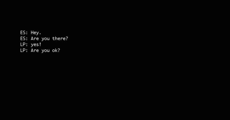
In smart-screen based cultures increasing amount of private facts, data, and metadata are documented in banal sequences of letters and numbers that thread through and wrap our own narrative journey to become the sole recorded memory, tragically yet comfortably replacing our connection to numerous life events, physical meetings or verbal dialogue. Events can occur only in textual form: document leaks, viral posts, trolling, revolutionary organising, the cult of personality, all occur through the incessant digital trails of algorithm filtered feeds, code, SMS, email, comments, tweets, and momentary whatsapp exchanges. The news of today is difficult to respond to with a slogan headline, only with bulk data releases in 8pt. Despite this increasing digitisation of social interactions, these new forms of network communication and language exchange rarely appear in native graphic form in documentary film. Laura Poitras’ CITIZENFOUR (2014) was an isolated instance of portraying textual exchange between protagonists and in another instance The Guardian’s ASMR (2016) documentary displayed what appear to be momentary Youtube comments and graphic symbols on screen.


For visual journalism hosted online there is also a possibility of removing the informational burden from within the frame, providing context through additional related text outside the frame. A recent diversion for Field of Vision has been to accompany their video journalism, namely Matthew Cassel’s The Journey (2016), with attached written journalism hosted on the platform of an established publication: The New Yorker. Supporting their short documentary films with an opinion based article has been a longstanding trait of The New York Times Op-doc. Never quite allowing an opinion piece to be in video form alone, perhaps demoting the self-contained film journalism to the status of an accompanying clip or feeling the film is insufficient to qualify as proper journalism for its readers.
Text outside the frame in the New Yorker is written by a different author to the film: each of Matthew Cassel’s six episodes are buttressed by an article from Ben Taub. The New York Times Op-Docs in contrast share the same author of article and video work. Does this written accompaniment evidence the journalistic deficiency of each medium alone? Or a fear to fully embrace the possibilities of purely audio-visual journalism? Could the apparent burden of textual information upon the art of documentary film lead to a sense of required separation of words not belonging in visual journalism, and their presence being an interfering not complementing tool in the edit suite?
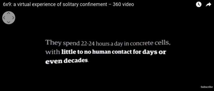
Virtual reality (VR) works will present a further challenge to visual journalists, obliged to communicate necessary information. In a three dimensional environment the word can inhabit space beyond the ‘flat screen’. Will it be curved with the frame? Will text be static or animated? Will text be tethered to objects? Should the written word exist at all as an informational device in such a potentially free medium? The Guardian’s 6X9 (2016), produced by Francesca Panetta, opens by continuing the tradition of plain text on a black background. The work then develops to project fragmentary facts on the walls of a solitary confinement cell. Unless the viewer faces these words in the space, the apparently vital information is excluded from the narrative experience. The type used in The Guardian’s VR work and documentaries bares no aesthetic relation to the content environment in which they feature, they are simply subject to brand identity restrictions, using the Guardian’s own font family.


Rather than attempt anonymity in font and graphic animation perhaps documentary directors ought to own this distinct voice, like Jean-Luc Godard’s repeated use of the Antique Olive font, Woody Allen’s Windsor, Adam Curtis’ manipulative upper-case Helvetica. Although Curtis claims that his distinct typographic choice is simply reductive communication of a message with no aesthetic consideration. The intertitle card, once of primary narrative value, is a lost art. If documentary makers don’t begin to wrestle with the power of words on screen to form a new grammar then old habits will creep into the realms of acceptability. The once omnipresent voice of God has for some time been a device to avoid, contemporary filmmakers are nurtured with a formal fear of objective, authoritative voiceover. However the disappearance of an audial fact giving voice has slowly propagated a new breed anonymous directorial force on screen: the omniscient card of God. A quiet bold white sans serif god.
Luke W Moody is a cineaste and maker based in London. He currently works for BRITDOC and co-curates FRAMES of REPRESENTATION. He tweets @zzzzzzzzzzzzoo
